The demands of social networking and community sites are increasing rapidly. For building a community/networking site you need to code it from scratch. But if you are not a pro coder or you don’t have a nerd team, building a social networking website is completely impossible. So as non coder to build Social networking website you can use CMS (content management system - readymade platform what helps you to build site) also known as platform software or script. With social networking CMS you will be able to-
Build a Social networking website in a short time
It can be use for personal or commercial purpose
Customizable, so you can modify any part of site as you want
Some of these CMS are open source (completely free and you can modify/upgrade the source code) and some of paid.
Let’s see what content management systems I talking about for building Social networking website.
7 best CMS/script for building Social networking website
Dolphin is the world's most advanced community CMS. It is Open source, independent, downloadable, scalable, customizable, full-featured, free software for building social networks, dating sites and web-communities. Loaded with video chat, recorder, video player, forums, groups, events, video messenger, mailbox, desktop app, video sharing, photo sharing, iPhone app and much more. Premium upgrade available.
Jcow is flexible Social Networking software written in PHP. It can help you to: Build a social network for your interests and passions, Build a member community for your existing website, Build a social networking site like Facebook, Twitter. Paid version got more customizable option.
Buddypress is a Wordpress CMS's plugin. After installing Wordpress you will be able to install this plugin and start a minimal social networking site on your Wordpress. Build a social network for your company, school, sports team, or niche community. BuddyPress lets users sign-up and start creating profiles, posting messages, making connections, creating and interacting in groups, and much more. BuddyPress boasts an ever growing array of new features developed by an awesome plugin development community. There are more than 330 BuddyPress plugins available, and the list is growing every day, multi language supports, updates regularly.
Oxwall is unbelievably flexible and easy to use PHP/MySQL, Community CMS/platform. Oxwall is used for a wide range of projects starting from family sites and custom social networks to collaboration tools and enterprise community solutions.
Beatz is an online social networking community script that allows you to start your own favorite artist band website. Beatz is an online community script for sharing, discussing and learning about new artists and your favorites.
Elgg empowers individuals, groups and institutions to create their own fully-featured social environment. Elgg is an open source social engine which powers all kinds of social environments - from education and business to martial arts and rugby. If you are looking for a professional social intranet or want to run a site for your organization.
Etano can be used to start up a dating site, a social networking site, a classifieds site or any other type of site involving groups of people, companies and products.
CMS are the great choice to make a site specially social networking sites, what got more sensitive functions. So choose what CMS you want to use, go to their site download the script, upload and install that, configure and start your social networking site without tension. Don’t forget to mention what you’ll be use.
CSS3 took web design to its most wanted attractive step. Using CSS3 effects on websites elements (text, images) makes our site look gorgeous and trendy. With this site I try to publish various CSS3 effects (base Button, Image effect) what you can use on your web project and Blogger blogs easily. To continue that here another super cool effect I presenting. It will give your image Swing effect on mouse hover. Made with CSS3 transform animation and keyframes to design the swinging pattern, it also cross browser supports. Let’s see how it looks like and how to enable it on your image of Blogger.
In our Blogger post we use various images as hint, example, for showcase an object or just as a part of post. Highlighting those images, effect’s on images necessary too. In Blogger’s default template your images automatically gets border and shadow effect, again if you are using custom template your may be not having any effect on your images. But if you want more specific effect on your images or you want to use custom effect on your Blogger blog you can use CSS3 effects for images. Here 5 superb, most popular CSS3 effect code I gathered (Shadow, Opacity, Tilt, Jump, Morph effects). See what image effect suits your images, and add them on your blogger images.
.ks-sado:hover {-moz-box-shadow:0 2px 10px rgba(0, 0, 0,.75); -webkit-box-shadow:0 2px 10px rgba(0, 0, 0,.75); box-shadow: 0 2px 10px rgba(0, 0, 0,.75); -webkit-transition: all .5s ease; -moz-transition: all .5s ease; -o-transition: all .5s ease; -ms-transition: all .5s ease; transition: all .5s ease;}
More customization :This shadow effect generate upon RGBA color code. If you want other color shadow on images Go to any color picker (Color Hexa) and place your color code's Hex digit on rgba(0, 0, 0,.75)'s first 3 '0', and Last 0 for Opacity.
CSS3 Opacity blur effect on Images
Just Opacity effect
HTML
<img class="ks-opaci" src="image link" />
CSS
.ks-opaci { opacity:.7;}
Opacity effect on mouse hover
HTML
<img class="ks-opaci" src="image link" />
CSS
.ks-opaci:hover { opacity:.7; }
Opacity effect on mouse hover with animation
HTML
<img class="ks-opaci" src="image link" />
CSS
.ks-opaci:hover { opacity:.7; -webkit-transition: all .5s ease; -moz-transition: all .5s ease; -o-transition: all .5s ease; -ms-transition: all .5s ease; transition: all .5s ease; }
Image will spin 360 degrees on mouse hover. As it’s spinning, 'border-radius' will cropped to 50%. From Design Shack.
HTML
<img class="ks-circl" src="image link" />
CSS
.ks-circl { -webkit-transition: all 0.5s ease; -moz-transition: all 0.5s ease; -o-transition: all 0.5s ease; -ms-transition: all 0.5s ease; transition: all 0.5s ease;}
Step 1: You need to embed the CSS code into your template. The effect you want to use in your post, First that effect's CSS code embed into your template.
Log in to your Blogger account, select your blog,
Select 'Template' tab, then 'Edit HTML',
Find (Using Ctrl+F or Cmd+F)]]></b:skin>
Above ]]></b:skin> paste your following CSS (Under pink color title) code,
'Save template'.
Step 2: After your image uploading done,
From post editor's top (Compose/HTML) Switch to 'HTML',
After clicking 'HTML' you will see your uploaded image's source tag code
<img border="0" src="image link" />
In this Image tag code add your following (what effect's CSS code you embedded into your template) effect's HTML class code. Example:-
If you embedded shadow effect's CSS in your template add class="ks-sado" into your image's Img tag
For Opacity effect class="ks-opaci" For Tilt effect class="ks-stumbi" For Jump effect class="ks-jumpi" For Morph effect class="ks-circl"
That's it.
All codes are universal, will be support on any browser (except IE), Any question, feedback leave with comment. New effects, shadow for images will be release soon, So stay subscribed. Goodluck..
The default image captioning method we usually use is just more like showing the name of images. That captioning method is bit simple and awkward ways of representing caption. So here I am presenting 4 trendy image caption method using CSS3 effects, (not jQuery - JavaScript). These image caption methods will show your image caption on mouse hover with
Curtain, Fade in out, Pop under, Slide from left effect.
All effect got maximum support with any web browser,
Easily customizable via CSS editing
Let’s see how these effects look like and how to use ‘em on your website project.
First copy and paste the CSS part on your site’s Stylesheet.css
Whether on your website you want to show this image caption’s there copy and paste the HTML part.
How to configure
At HTML part’s ‘Image link’ paste your image link, on which image you want to show caption Into <p> and </p> tag write your caption
As your image’s height and width delete default code and place your image height and width. And also fix the caption’s height width too if effect does not showing right.
Compatibility These effects are optimized for maximum fallback support with major web browser. Any browser with CSS3 Compatibility will show these effect easily.
Any feedback leave with comment, soon I’ll publish more image caption method so stay subscribed.
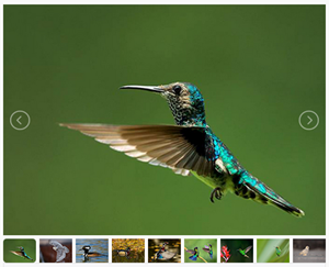
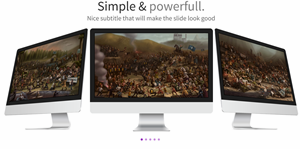
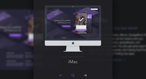
Image sliders are the best way to highlight your prior content on homepage/landing page. In the vast web world you may find a large number of Image sliders, and maybe you don’t have sufficient time and patient for checking all of them out. So here I tried to scale down the number to 15 and presenting 15 of the best free, responsive and latest tech enriched content sliders. See their demo and download them, then use them on your project. Read on:
1. FlexSlider
An awesome, fully responsive jQuery slider toolkit.
unslider is a responsive and cross-browser jQuery plugin for creating clean and flexible content sliders on your web site. unslider currently supports almost all the html elements like image, text, video, etc.
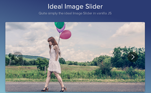
The aim behind the Ideal Image Slider is to create a slider which has just the right amount of features, with no bloat and be easy to extend so that more features can be added as “extensions”. Here are the ideals and core features:
HTML5 (SEO optimised)
CSS3 transitions (a few simple transitions like slide/fade)
Slider Pro is a professional jQuery plugin which allows you to display a group of mixed content in a responsive and touch compatible slider. Key Features:
Responsive slider plugin for jQuery. Intrinsic trick to enable responsive resizing without js!
Slippry is a pretty customization slider, included some (slightly random) combinations of options and the function settings and CSS (if applicable) to recreate them.
Designs/styles: Out-of-the-box, Pictures, Portfolio, News, Shop, Thumbnails, CSS vs jQuery.
It is a common approach to fill in the intro section of a website with a slideshow: you’re trying to show the users as much as you can above the fold, yet you want to deliver this information in an organized and clean way. Therefore we built for you a ready-to-use jQuery slider, with some built in options like video/image backgrounds and different text alignments. In an attempt to increase user engagement, we replaced the “navigation arrows” with buttons. The difference is: buttons have a title, a hint about what kind of content to expect. Arrows just tell users “you can switch slide”.
Zenith is responsive slider jquery plugin that comes in 4 basic layouts and 7 transition animation available
4-th layout, or slider layout, has some variations of its own, producing 3 more pre-defined sub-layouts and unlimited possibilities of styling, editing and creating some of your own variations.
You can edit some HTML, and add that markup by passing it’s elements classes or id’s to the options when initializing zenith.
Zenith differs from other responsive slider jquery plugins in dozen ways.
It’s unique layouts for showcasing highlights will enhance your product, or app presentation.
You can style almost every part by passing your own custom CSS directly into options, without even touching the main style.
A responsive slider jQuery plugin with CSS animations.This plugin does not use jQuery animations. Only CSS3, because performance matters. No need to calculate distances, sizes or whatever, only add and remove classes to elements to animate them. It couldn’t be easier!
Only 1 js file, 1Kb minified
Responsive
Multiple effects (more than 60!)
Works with html, images… whatever you want to animate
A simple content slider with depth-like zoom functionality for a predefined area in each slide. Each slide has a predefined zoom area that will be used to calculate the appropriate scale value for a fullscreen fill. Once the icon for zooming is clicked, the zoom area as well as the page get scaled, creating the illusion that the viewer is approaching the item. Once the whole page is covered, it shows some more details.
slider.js is a lightweight, simple-to-use jQuery plugin that helps you generate a fullscreen, responsive slider carousel for showcasing your photos, designs and stories.
So what you think about this list don’t forget to mention. More Cool slider information base list will be publish soon, so stay subscribed. Goodluck…..
The navigation menu styles we mostly see around on web are sidebar menu, vertical menu, fixed to header menu etc. It’s very rare to spot a site with vertical text/link style menu, right? So here it is I developed this vertical text/link style menu which offers; links are hanging from top side of site, and links will be shown vertically. This menu made with CSS3 transform formula to make links appear vertically and added opacity effect and cheerful flat color to each link enhanced with Google web font. Let’s see how it looks like and to create this menu. Read on-
How to create Vertical text/link navigation menu
How to: Step 1:First create a navigation class; and all positioning codes-
Step 3: Now designing the ‘a link’ elements with font style, size, decoration and color.
.nav ul li a { color: #fff; text-decoration: none; display: block; font-family: 'Josefin Sans', sans-serif; font-weight:500; font-size:16px; }
Step 4:Then individual color and hover color setting up for <li> elements with rgba color codes; we creating 5 link slot so setting up their color respectively with l1, l2, l3, l4 and l5 <li> classes.
.nav ul li.l1 { background-color: rgba(243, 156, 18,0.65); } .nav ul li.l1:hover { background-color: rgb(243, 156, 18); } .nav ul li.l2 { background-color: rgba(207, 0, 15,0.65); } .nav ul li.l2:hover { background-color: rgb(207, 0, 15); } .nav ul li.l3{ background-color: rgba(54, 215, 183,0.65) } .nav ul li.l3:hover { background-color: rgb(54, 215, 183); } .nav ul li.l4{ background-color: rgba(25, 181, 254,0.65) } .nav ul li.l4:hover { background-color: rgb(25, 181, 254); } .nav ul li.l5{ background-color: rgba(65,117,160,0.65) } .nav ul li.l5:hover { background-color: rgb(65,117,160); }
Step 5: It’s time to call ready CSS classes to HTML; So I’m using a <div> to call .nav you may call it under <nav> for integrating design to HTML5. Adding <ul>, <li> and <a> elements. And finally finishing the design.
Step 6:Place links in "#" and change anchor texts as you like. Change color code of <li> with your desired rgba color. And here are the full codes of this vertical text style navigation menu:
<!--crawlist.net HTML starts--> <div class="nav"> <ul> <li class='l1'><a href="#">Home</a></li> <li class='l2'><a href="#">Blogger</a></li> <li class='l3'><a href="#">Wordpress</a></li> <li class='l4'><a href="#">About</a></li> <li class='l5'><a href="#">Contact</a></li> </ul> </div> <!--crawlist.net HTML ends--> <style>/*crawlist.net CSS starts*/ @import url(https://fonts.googleapis.com/css?family=Josefin+Sans); .nav { position: relative; float:right; top: -3px; } .nav ul li { -webkit-transform: rotate(-90deg); -moz-transform: rotate(-90deg); transform: rotate(-90deg); width: 100px; overflow: hidden; padding:5px 10px 10px 18px; float: left; background-color: #7f9db9; text-align: left; margin-left:-50px } .nav ul li a { color: #fff; text-decoration: none; display: block; font-family: 'Josefin Sans', sans-serif; font-weight:500; font-size:16px; } .nav ul li.l1 { background-color: rgba(243, 156, 18,0.65); } .nav ul li.l1:hover { background-color: rgb(243, 156, 18); } .nav ul li.l2 { background-color: rgba(207, 0, 15,0.65); } .nav ul li.l2:hover { background-color: rgb(207, 0, 15); } .nav ul li.l3{ background-color: rgba(54, 215, 183,0.65) } .nav ul li.l3:hover { background-color: rgb(54, 215, 183); } .nav ul li.l4{ background-color: rgba(25, 181, 254,0.65) } .nav ul li.l4:hover { background-color: rgb(25, 181, 254); } .nav ul li.l5{ background-color: rgba(65,117,160,0.65) } .nav ul li.l5:hover { background-color: rgb(65,117,160); } /*crawlist.net CSS ends*/</style>
Compatibility:
This menu is compatible with all latest version of web browsers.
So what is your opinion about this navigation menu don't forget to mention, Chill....
We use code playgrounds/online-cloud based HTML editors for instant web developing, creating snippets, or making use of existing code snippets for time saving, cloud base backup etc. Now days uses of online HTML editor is rising rapidly cause online playgrounds or code editors that provides instantly ready coding atmosphere through web applications that allow real time editing and previews of client-side codes for experimenting with CSS, HTML, PHP, JavaScript and instant result help you to develop useful web project and save them, sendboxing tools for testing, debugging and sharing your code snippets. Here I am presenting 10 of Best Code playgrounds/Online HTML Editors for developers; read on:
10 Best Code playgrounds/Online HTML Editors for developers
1. Codepen CodePen offers the coolest user interface without costing money. It’s a sophisticated playground for the front end side of the web. It’s all about inspiration, education, and sharing. The service highlights popular demonstrations and offers advanced functionality such as sharing and embedding.
2. CSSDesk CSSDesk is an Online HTML5, CSS3 Sandbox. It allows people to quickly test snippets of CSS code, and watch the result appear live, offers account, cloud saving, pro features, clean interface and code preferences. It does not have lots of fancy features its simplicity gives focus on the things that matter.
3. Cloud9 Cloud9 IDE lets you code and chat together with your fellow developers, share your workspaces or keep them private. Set up your system without any hassle, Built-In Terminal For command-line wizardry, Language Tools Make writing code a breeze, Debugger, Configure your own UI, themes, run panel, Built-In Image Editor etc it’s the best premium IDE in the world.
4. JSFiddle jsFiddle is a shell editor that eases writing JavaScript code by creating a custom environment select the framework MooTools, jQuery, Dojo, Prototype, YUI, Glow,Vanilla then start editing. It has ability to save, share and embedding the code. Unlike Codepen, JSFiddle got no live previews; You have to basically refresh the page by clicking on the play button.
5. JS Bin JS Bin is a web-app specifically designed to help JavaScript and CSS coders to test snippets of code, debug the code collaboratively. JS Bin allows you to edit and test JavaScript and HTML. You can save, and send the URL to a peer for review or help.
6. ShiftEdit ShiftEdit is an online IDE that syncs and backs up your code revisions. It supports real-time validation, sophisticated auto-complete, syntax checking, function definitions make programming a breeze All Browsers, Terminal, Customizable snippets, notes, change themes, Connect to your project files wherever they reside (FTP, SFTP, Dropbox, Google Drive, Clone a repository from Github/Bitbucket)
7. Dabblet Dabblet is an interactive playground for quickly testing snippets of CSS and HTML code. It uses prefix free, so that you will not have to add any prefixes in your CSS code, save your work in Github, embed it in other websites and share it with others. It currently only supports modern versions of Chrome, Safari and Firefox.
8. Liveweave Liveweave is a useful HTML5, CSS3 & JavaScript playground and a real-time editor packed with features such as having the capability to turn off its live preview, take better care of your eyesight with the night vision mode, offers over 20 JavaScript libraries, supports SVG, It also comes with a built-in ruler. It is a great tool to test, practice and share creations.
9. Editr Editr is a HTML, CSS and JavaScript playground that you can host on your server. It is based on ACE Editor. Its super easy to setup. It supports multiple instances on one page. Configurations are available via JS object or HTML attributes supports 3 layout views: horizontal, vertical and single. First two are for live edit. Third one is for presentation. Editr is licensed under MIT License.
10. The HTML5 Playground This service includes a library of code snippets you can explore to see HTML5 in action. They include some basic getting-started examples, such as the use of the HTML5 Doctype and the audio tag, including HTML5 elements such as range and date inputs and automated validation for email addresses and websites.
So what you use, which one is your favorite worth mentioning don’t forget to mention :)
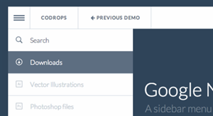
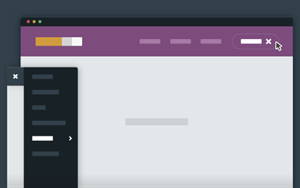
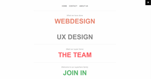
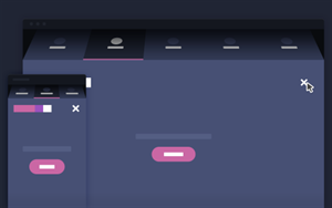
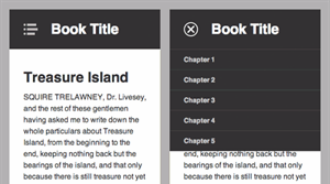
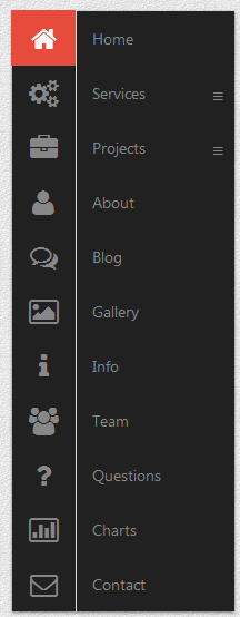
Are you looking for high-end responsive navigation menu for your web project take a look at these examples, demos, and tutorials on responsive navigation menus; they collected from all over the web and best of other menus around. Most of them compatible with any sites frameworks and they developed with CSS3, HTML5, JavaScript, jQuery by excellent hands. Read on: